84 Sugar Puss on Dorchester Street
A1.a.
SUGAR PUSS |
ON | DORCHESTER STREET | [ornament: company logo] | By | AL PALMER
Collation:
pp. [1-4] 5-7 [8] 9-15 [16] 17-21 [22] 23-39 [40] 41-45 [46] 47-67 [68]
69-73 [74] 75-79 [80] 81-93 [94] 95-122 [123] [124] 125-141 [142] 143-149 [150]
151-159 [160]; 177 x 107 mm.
Contents:
p. [1] About this book…; [2] NEWS STAND LIBRARY POCKET EDITION | First Printing NOVEMBER, 1949 | Printed and Bound in Canada | Export
Publishing Enterprises Limited | TORONTO LONDON NEW YORK; [3] title; [4] blank;
5-7 PREFACE; [8] blank; 9-10 THE CHARACTERS; 11-159 text; [160] blank.
Binding: Perfect. Inside covers pattern with
logo – vivid red.
Note:
Paperback original. Signed art by D. Rickard.
A1.b.
Collation:
[1-516]; pp. [1-4] 5-6 [7] [8] 9 [10] 11-21 [22] 23-39 [40] 41-45
[46] 47-67 [68] 69-73 [74] 75-79 [80] 81-93 [94] 95-117 [118] 119-122 [123-124]
125-141 [142] 143-159 [160].
Binding: Stapled gatherings. Inside covers
pattern with logo – moderate brown. “SUGAR PUSS” on back cover shifted 7 mm to left.

A1.a.
SUGAR-PUSS |
On Dorchester Street | To Sean Edwin | who didn’t give a damn either! | by Al
Palmer
Collation:
pp. [1-7] 8 [9] 10 [11] 12-39 [40-42] 43-78 [79-81] 82-125 [126-129] 130-159
(but with an unnumbered first page for 21 of the 25 chapters) [160]; 176 x 106
mm.
Contents:
p. [1] the book at a glance; [2] | NEWS STAND LIBRARY POCKET EDITION |
First Printing February, 1950 | Printed and bound in Canada | [ornament:
company logo] | Export Publishing Enterprises Limited | TORONTO LONDON NEW
YORK; [3] title; [4] ALL NAMES,
CHARACTERS, | AND EVENTS IN THIS BOOK | ARE FICTIONAL, AND ANY | RESEMBLANCE TO REAL | PERSONS WHICH MAY SEEM
| TO EXIST IS PURELY CO- | INCIDENTAL.; [5]-159 text; [160] blank.
Binding: Perfect. Inside covers pattern with
logo – moderate brown. “KN” on spine printed red, “20A” on spine black. Back cover
copy: “Sugar Puss | ON DORCHESTER STREET” at top of blurb and “Sugar Puss”
larger font size; “A NEWS STAND LIBRARY POCKET EDITION” at bottom of blurb.
Note:
Paperback original. Signed art by Sid Dyke.
A1.b.
Binding: Inside covers pattern as A1.a.“KN” on spine printed black, “20A” as A1.a. Back cover blurb as A1.a.
A1.c.
Binding: Inside covers pattern with logo – vivid blue. “KN” and “20A” on spine as A1.a. Back cover blurb as A1.a.
A1.d.
Binding: Inside covers pattern with logo – vivid red. “KN” on spine as A1.a, “20A” printed red. Back cover copy is advertisement
for In Passion’s Fiery Pit.
A1.e.
Binding: Inside covers pattern with logo – vivid red.
“KN” and “20A” as A1.d. Back cover copy:
“Sugar Puss | On Dorchester Street” at top of blurb, both same font size; “A
NEWS STAND LIBRARY POCKET EDITION” missing.

Binding: Inside covers
patter with logo – vivid red. Spine and back cover as A1.e. Dust
jacket attached at spine – number C8.


Vehicule - 2013

Vehicule Back

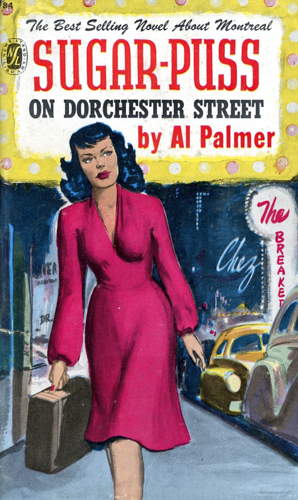
Bowdler, as series editor, I thought your readers might be interested in knowing something about the Ricochet cover of Sugar Puss on Dorchester Street. To date, we've played homage to former covers of the books we've reissued. Typically, this has involved not much more than minor tweaks.
ReplyDelete(The first Ricochet printing of The Body on Mount Royal is an exception.)
What with three illustrations from which to choose, you'd think we were spoiled when it came to Sugar Puss on Dorchester Street. The funny thing is that not one satisfied. My favourite, the second, in which Mlle Lepine leans against a brick wall, was rejected because "DORCHESTER STREET" was too small. Besides, where is "ON"?
The third was too monochromatic... and, again, "DORCHESTER STREET" was too small.
We liked the first, mostly because "ON DORCHESTER STREET" was not too small, but the cover was felt to be too bright. And so, it was made more dark, so as to fit into what we aim to be the collection of post-war noir.